Thursday 14 January 2016

Why I like pastels


I 
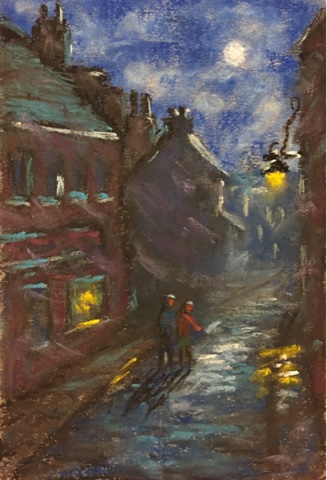
love painting nature, in particular landscapes and seascapes. I also find light fascinating which draws me to cityscapes and how the light changes on the surface of buildings as the day progresses.
My medium of choice is pastel for the following reasons:
The vibrancy of the colour

 Pastel is pure pigment with a small amount of binder, just enough to hold it in stick form.  When the pastel is not blended with the finger, the particles of pastel reflect light to an even greater degree.
The tactile nature of pastel
Being in a stick form, your in direct contact with the medium.  While some don't like getting their hands dirty, there are greater rewards being in direct contact with the medium which show through in your work.
Immediacy 
Pastel can be applied quite quickly covering large areas in a short time.  Mixing on the paper and not on the palette is another way we get instant impressions of what our artwork is going to look like.
My final reason I love pastel is that it's quite forgiving.  Mistakes can be erased and covered quite easily.

Wednesday 13 January 2016

Year of the monkey

Year of the monkey
229mm x 152mm on paper
photo ref.

Here in Japan, where I currently live and have lived for 12 years now, Japanese people send New Year postcards which always include a sign from the Chinese zodiac.  I painted one in pastel this year.

It depicts a monkey sitting by the water's edge watching the first sunrise of the year.

The monkey is largely silhouetted but for a glow on the outer parts of its fur. 

Day at the beach

Day at the beach 
229mm x 152mm on paper
Light-toned brown Daler & Rowney 
Sennelier and Holbein pastels used


I used a photo of the cliffs of Dover for reference on this painting. I loosely painted in some people to create some activity.  I changed the sky from the photo to include some thin light clouds.

Amber Dusk

229mm x 152mm on paper

Mid-tone brown Daler & Rowney 

I used a photo for reference for this piece.  

I tried to capture the mood of the photo as best you can when using photos.
I was quite happy with the reflected light on the ridge of the mountain, this was the first time I tried this effect. 


 I blended using my fingers on a lot of the sky, but I purposely didn't blen for the bright yellow light above the sun and the reflections on the water's surface. 
I've learned that blending reduces the light that can be reflected off the particles of pastel dust.

Peter Coombs

What can I say about Peter Coombs apart from his pastel paintings are great and I wish he had a site or blog where more people could see his work.

Peter Coombs is a professional artist from Britain whose art has been shown in various countries around the world.
To my knowledge he's produced two books that introduce pastel art in a step by step format.

I was recently given one of his books "Painting with Pastels"
I followed his step by step instructions in order to get a feel for how he paints and the style he uses. Below are some of the pieces I painted from his lessons in the book...


This one is called Landing the catch
It's 129mm x 152mm on Daler & Rowney pastel paper, mid-tone brown on the  textured side.


Country lane
Same size as above. 


Moonlit Stroll
Same size as above but portrait on mid-tone grey.

These painting were a nice little exercise in paining in a loose style which I'm not yet accustomed to.

I have no ties to this artist but I highly recommend this booklet.
There's a few more lessons in this booklet I haven't done yet, I'll get round to them in the near future.

Tuesday 12 January 2016

Pond Reflections


330mm x 230mm Canson on the smooth side, no underpainting

 This summer I visited a Japanese garden as I do a few times a year.  It was late in the afternoon, a couple of hours before sunset, and I took a nice photo of the main pond there.
This painting didn't turn out exactly they way I had planned.  I struggled with the reflections of the trees and even the foreground grass. it was good practice though.